Showing posts with label Creative Thinking. Show all posts

Friday, May 8, 2009

Caution - Twitterholic crossing!

Readers - Thanks to all those who commented/mailed/tweeted me their comments on my Twitter-Toons.
Here comes the last one.
I dont really wanna make tonnes of them... so here we go: 
{Click the image to enlarge}
Enjoy!

Saturday, January 17, 2009

4D Graphing technique for KPI visualisation

Data visualisation techniques have been an area of research since so many years. Veterans like Dr.Edward Tufte have written several books on these subjects.

Most effective data visulaisation technique will use minimum ink, represent maximum amount of data and convey the message EFFECTIVELY to the viewer with out third party explanations. In other words, the graph will speak for itself. Simplicity and pleasing appearance (Shapes & Shades) are icing on the cake.

Graphs are to be chosen on case-to-case basis. It is up to the data visulaiser to decide what he wants to convey and choose the graph accordingly.

Those who are lazy and those who don’t care about the end users will supply them with a standard table. Most users, especially senior management won’t be interested in reading and apprehending long data tables. Even if they go through the table table taking lot of time, they may not be able to come up with some conclusions, which fail the basic intention of reporting itself!

Lets take a business case in Project Management. Earned value management (EVM) is one of the greatest tools in Project Management which allow project team to assess project performance, draw conclusions and implement remedial actions for slips and overruns. It is kinda ‘Early Warning System’. CPI (Cost Performance Index) and SPI(Schedule Performance Index) are two major indices measured in EVM.

Business Case:
In company XYZ Inc, there are lots of projects executed simultaneously. Contract value of these jobs differs significantly. Profitability of the company greatly influenced by few major jobs. Now XYZ Inc has got a very good system to monitor progress & costs for each project. CPI was reported on weekly basis for all the projects by the Project Control Engineer in the following format:
There were 100’s of ongoing projects in the company and hence the table was too big. A small decrement in CPI of a big job has serious effect on overall performance of the company. How ever such critical jobs lost somewhere in the crowd of 100’s of jobs and often left un-noticed! Several bad performing small jobs also affect the profitability if not controlled on a 1-to-1 basis.

So what is the solution, which shows the ‘SIZE & SEVERITY’ of each job in single graph?

Solution:
PM Karma has a solution for this. Take look at the 4D-Graph for KPI’s given below:
The bubble plot is an X-Y graph , but here it is not just showing 2 –parameters like an ordinary X-Y graph or 3 –parameters like a bubble graph. Each point in the above graph bears 4 parameters:

1.    Project ID (Y-Axis)
2.    Progress % (X-Axis)
3.    Budget value in $ (Size of bubble)
4.    CPI (Colour of bubble)

Result :
Now the management will never miss a big job with a bad CPI , since it will be represented as a ‘Big’ bubble with red colour ! The relative sizes of bubbles & colours aid the senior management to zero in ‘real trouble makers’.

While the first graph (Bubble graph) represent snapshot ‘at the moment’, the line graph given at the bottom provides trend over a period of time (weekly, as given here).

Technique:
The above graph is generated using Microsoft® Excel ™. I have given different colours to bubbles by creating ‘Series’ with ranges.

Footnote:
The above technique can be used for other KPI’s also like SPI, Productivity ...etc. Spread your imagination, you may be able to find better ways. If you have something better , please share.
Of late, I have been doing a lot of research on unconventional data visualisation techniques. This again goes with my strategy 
“If everyone were doing things in the same way others did, the world wouldn’t have been progressed , ever!’
Disclaimer: XYZ Inc ,job numbers and budget values are imaginery and real life situations may need alternate representation/customizations.

Sunday, November 9, 2008

Dashboards and the hottest trends in executive reporting


If you browse through my previous blogs and profile, you will easily find that, I am a person greatly interested in graphical representation of ideas & data (Drawing, charting, visual thinking  ...etc). I have a nick name in my office (Present and even previous jobs!) – “Mr. Colour”!
This is because of the colourful reports which I produce week after week, as part of my job. Being a planning professional , I produce a lot of reports every week (Project specific & organisational).
Microsoft Excel is my all time favourite tool. It is a blend of an ultimate data processing/ analysing tool and a nice data visualisation tool. Excel is the little big thing that makes my life much easier by automating several reports. I have a hell lot of data to process every week and report. I have made some standard templates which make data entry and reporting quite easy. Infact I only make the re-usable templates. The required data fields are filled in at the end of the week and reports are generated. The interface is designed in simple manner so that data entry is minimum. I extensively use formulas and macros to impart ‘intelligence’ and automation.
There are some great websites which give me tips & tricks on advanced excel data processing & charting.
If you are a frequent browser in excel based reporting techniques, you may find the following as the hottest topics or say ‘hottest tags’:
HOTTEST KEYWORDS IN EXECUTIVE REPORTING
  • Dashboards                   
  • Incell charting               
  • Sparklines                     
  • Bullet graphs                 
  • Heat maps                    
  • NY Times info-graphics
  • Edward Tufte               
I am afraid that the love for incell charting is going beyond limits! People may soon start qualifying dash boards based on the number of incell charts used! (I hope I am allowed to use humour in blogs!) My understanding is that, growth in the financial analysis process in previous years has resulted in such a huge attraction towards dash boards and incell charting. Finance, especially stock market is one place where you have quantum of data which changes every second. To analyse and report such ever changing complex data, innovative dashboards evolved. This has obviously spread into other sectors as well, but finance professional are the one’s who use dashboards extensively. The second position will go ‘Marketing & Sales’.
Google analytics” is one of the best examples of clever implementation of online dashboard concepts (Or in general ‘Dashboard concepts”). I think NY Times Online really rocks in the domain of info-graphics!
Dashboards are mainly meant for decision makers who don’t have time to go in detail but can’t miss trends and alerts. This provides a challenge for the executives to prepare ‘effective’ dashboards (usually single page) which give the ‘whole idea of the thing’ ‘at a glance’!
Crystal-Xcelsius Dashboard :
 Crystal-Xcelsius provide a great tool to produce Adobe Flash based interactive dashboards easily.As their website say "Xcelsius 2008 is the first and only dynamic and customizable data visualization software that enables users of different skill levels to create insightful and engaging dashboards from any data source with point-and-click ease. Xcelsius 2008 offers a comprehensive set of new features and integrations with Crystal Reports 2008BusinessObjects Enterprise XI 3.0, and other market-leading products—making it easier than ever to put the power of relevant intelligent information into the hands of business users."

Toolkit for great dashboards:

  • Good quality data, nicely arranged in table (Usually against a timeline)
  • MS Excel (Preferably Version 2000 or above)
  • Some nice web icons and textures
  • Paper & pencil (If you have the habit of planning interface layouts)
Steps for getting started

  • Identify the critical information to be displayed
  • Decide mode & unit of representation
  • Plan the lay out
  • Implement dashboard in excel by drawing charts / tables and linking data
  • Review & get approval
  • Release
You may find several innovative and creative experimentations in Excel charting, online. But my advice is never design your dashboard around a new charting concept. (Or simply, never include a graphical element in your report just because it looks cool.) Always design your dashboard around your data.
Identifying what really management want to know or need to know. Those should be in your dashboard. Selection of the type of chart & colours also does matter. Be consistent with colours (If you use green for + , never use red for + elsewhere!)
Project managers can impress senior management and clients by producing ‘Project Dashboards’. You may include standard and project specific indicators.

PROJECT DASHBOARD
I ) Textual/ Tabular
  • Major milestones achieved (Show with time line & thumb nails of progress pics, if possible)
  • Activities progress during reporting period
  • Major issues, risks
  • Billing history
II) Graphical
  • Project S-Curve (Planned, actual, forecast)
  • Manpower histograms (Planned , actual)
  • Cost curve (Planned , actual, forecast)
  • Earned value analysis charts
  • CPI & SPI graph
  • Productivity curves
  • Analysis of head count , trades ,manhours( Normal hours v/s overtime) – Pie Charts
  • Safety reports (LTA ..etc)
If you have a good IT department with some skilled web developers, you may think about developing a web based project reporting system. This can be data driven (Database at the back end). The advantage of this feature is accessibility form anywhere for project team, clients and senior management.
You may check out some websites which provide some of these facilities for free. But suitability and effectiveness will depend up on the way project team utilise, the given facilities on these websites and nature of your project.

Thursday, November 6, 2008

The Obama Project


End of all speculations and debates, the result is out ! Obama wins. Sweet ending for massive efforts lasted for several months.
Every one who watched the election campaign will agree that the victory was not just an accident. I would say that it was a very well planned and professionally executed PROJECT.
Extensive use of web technologies and networking techniques were the stunning features of this great project.
 ‘Wired.com’ says “Propelled by internet, Barack Obama wins US presidency !” It is very much true. The focal point of his campaign was his website www.barackobama.com . The site was very professionally designed with solid objectives.
  1. Source of information
  2. Networking
  3. Fundraising
The site is so good looking and the features and content were outstanding! It arranges essential information under easily navigate-able menu structure. It gathers people as followers, volunteers and donators.
Market personality >> Create followers >> Raise fund : This was the tactic used.
I am greatly inspired by the way entire campaign was planned, executed and concluded.
Just check out the MyObama community post sent out few hours before close of the voting:
Our target today is to make 1,000,000 calls to voters in battleground states before the close of polls tonight. As of 1:00 PM Eastern, we've made 214,187 calls. However, our staff on the ground are telling us that we need to reach the 500,000 call mark by 3:00 PM Eastern Time.”
Follower communities were well connected through his website, were intimated about the local and national campaign events. They were given instructions and specific targets. True project management!
They have engaged "RIGHTNOW” – a leading CRM company to manage increasing number of voter’s calls and e-mails. This was a ‘shift’ in the way political campaigns were managed, by employing a company who manages consumer issues for big corporate. "RIGHTNOW designed tools for assigning teams and managing (acknowledging, responding, following up..etc) voter communication. FAQ (Obama Answer Center) sections which allow users to find answers to frequently asked questions about Obama. This section had many handy tools like “Search answers” Apart from this there were numerous tools for analysing the data and giving trends. Using these tools the campaigners were able to find the traffic from various constituencies, most used key words and more frequently asked questions.
Apart from this, for online team management they have employed another tool “Central Desktop ”.
CentralDesktop is a web based “Project Collaboration Tool for Teams
I am sure the “Obama Campaign” is going to be subjected to lots of research & studies on its marketing & project management perspectives !
Links:

Tuesday, October 28, 2008

Life beyond Gantt charts

Gantt charts got introduced into Project Management around 1915 only.  Credit of developing Gantt charts goes to Mr.Henry Gantt who was an American mechanical engineer. How ever he was not the one who invented this concept. The first known Gantt Chart was developed in 1896 by Karol Adamiecki, who called it a Harmonogram . But he never tried to popularise the concept and when he published some details about this new concept, it was all in Russian ! So he nearly missed the fame, or else we would have called those charts ‘Adamiecki Charts’ or something like that! [I think many people in Russia & Poland are still calling schedules as 'Harmonogram'  and not Gantt Chart!]

Gantt charts are part of most of the project management software. Infact most of the people think these project management or scheduling software as ‘Gantt Chart Making Machines’ !! When ever you hear ‘Primavera’ or ‘MSP’, I am sure the first thing comes in to your mind will be a screen shot of Gantt chart! – Blue, yellow and red bars securely guarded in grids!(Prison ??) There are other tools or representations for schedule like Network Diagram , but for most of the people a schedule is a gantt chart.

I have observed that people show reluctance to go through huge schedules (which are basically Gantt charts) in detail. Generally those beyond 2 pages (read – a few hundred activities!). 
(Image courtesy - Edward Tufte - http://www.edwardtufte.com/)

Undoubtedly Gantt charts are an effective way of scheduling. Computerised Gantt charting help generation of histograms & s-curves. 
Well , something useful will go popular , thatz it !

Gantt Charting was a revolutionary concept when introduced. But whatz next ? Approximately after a century since its invention, are we going to witness any revolutions in scheduling? If yes, what are the possibilities? How are we going to solve the issue of crowded crampy unreadable cluster of activities and relationship lines?
Let’s define the major objectives of scheduling:
1)      To identify & list out what to do in the project
2)      To decide and indicate when to do and on what sequence
3)      To find out how long it will take to complete
4)      What resources , how much needed ,when
A Gantt chart shows first 3 things graphically. Fourth one is entered in scheduling software against each activity & resource histograms are generated.
What if , we can include some pictorial representation to the activities?
What about assigning a graphic/icon (customisable with sub titles) to WBS and activities?
Follow the style of ‘Menu structure’ in interactive multimedia software’s, where an ‘icon’ is used to represent a menu item with a short description. When menu icon is clicked it will open sub menus.
Again sub-menus are graphical (which even layman can understand!) , with a ‘Back’ link to the parent menu item (Preferably a ‘Home’ link for the root menu).
Will that be great, if I can browse through the details of any project at the ease of browsing through an interactive brochure? Those who are interested can always go to minute details , others can just browse through the top level activities / WBS. A great tool for management reporting isn’t it? Well, even site supervisors and foreman can understand this graphical schedule better than traditional Gantt charts.
Now let’s call the ‘root’ menus as ‘WBS’ and work packs. The terminal elements or contents are activities. In these activity pages, we can provide more information like photographs, drawings, resource details..etc (Minimum requirement should be an activity description – always keep ‘minimum’ requirements for ‘busy’ people !!)
The icons should be placed in the back drop of columns, which is the ‘Time Scale’. There is no grid, unlike traditional Gantt – there are only columns. Activity relations can be shown with simple arrows. (Flexible ‘free hand’ arrows) .When a WBS (menu item) is clicked the work packs appear in blank screen. Again the work pack items are distributed against time scale (each work pack is a small graphic with sub title). When any one work pack is clicked, it will show the activities under that work pack (again they are graphics distributed against time scale) When any of the activity is clicked, it will show the activity page, which show complete info about the activity. Back, forward & up (one level up) links should be provided for easy navigation.
To sum up, each page except the activity description page (the terminal element) are graphical menu items distributed against time scale with link arrows. Since activities of a particular level are only displayed at a time, the screen won’t be cluttered. It will be pleasant to eyes and easy to understand. Those who want to se how each WBS elements and work packs are planned, can go deeper by clicking the corresponding WBS/ Work pack.
Let the traditional Gantt chart co-exist with this and let the software do all the calculations which it used to do for scheduling and resource allocation. Just add one feature to that – ‘Add icon / graphic’.  
The new ‘graphical schedule’ interface is an ‘Add-on’ additional feature. Because – a picture says a thousand words! And more over, people like simple reports... Not really those boring bars jailed in black and white grids!!

What about printing?
Printing removes the interactivity of the report. But each screen can be printed out separately (if needed) and can be correlated though proper numbering & coding. If the print results in a bunch of A4 sheets, the top one will be the WBS (which most of the senior management are interested in!) A cool graphical representation of project with some crispy titles and linking arrows distributed against a time scale.
Print only the details which are necessary. Relevant work packs can be displayed where work is happening.
Now there is an issue with file size. I am sure Adobe™ will surely have some solution for this. Because they own the wonderful flash file format which renders megabytes worth graphical content in mere kilobytes!
If anybody wants to build this application, I would expect that to be built in ‘Flash’ platform. It is visually rich, web ready, streaming and it has got great scripting features. Back end, it should use the proven scheduling algorithms.
I would expect release of such a ‘Graphical Scheduling Package’ –“GSP” , by 2010 !
Well, any time I am expecting calls from software corporations, who want to cash the next revolution in scheduling! – “Graphical Scheduling”.(haa haaaaa…)
You may feel this as a great idea or even foolishness , but I feel creative thinking should go on. If every one were happy of what they had yesterday, the world wouldn't have been the same. After all creativity & innovative thinking are the growth drivers for mankind!

Further Reading:


Gallery:
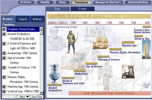
View some of the interesting time lines and GUI's (Click to Enlarge)
http://www.sonic.net/mnitepub/pccafe/reviews/grolier2000/timeline.jpg