

Gantt charts got introduced into Project Management around 1915 only. Credit of developing Gantt charts goes to Mr.Henry Gantt who was an American mechanical engineer. How ever he was not the one who invented this concept. The first known Gantt Chart was developed in 1896 by Karol Adamiecki, who called it a Harmonogram . But he never tried to popularise the concept and when he published some details about this new concept, it was all in Russian ! So he nearly missed the fame, or else we would have called those charts ‘Adamiecki Charts’ or something like that! [I think many people in Russia & Poland are still calling schedules as 'Harmonogram' and not Gantt Chart!]
Gantt charts are part of most of the project management software. Infact most of the people think these project management or scheduling software as ‘Gantt Chart Making Machines’ !! When ever you hear ‘Primavera’ or ‘MSP’, I am sure the first thing comes in to your mind will be a screen shot of Gantt chart! – Blue, yellow and red bars securely guarded in grids!(Prison ??) There are other tools or representations for schedule like Network Diagram , but for most of the people a schedule is a gantt chart.
I have observed that people show reluctance to go through huge schedules (which are basically Gantt charts) in detail. Generally those beyond 2 pages (read – a few hundred activities!).
 (Image courtesy - Edward Tufte - http://www.edwardtufte.com/)

Undoubtedly Gantt charts are an effective way of scheduling. Computerised Gantt charting help generation of histograms & s-curves.
Well , something useful will go popular , thatz it !
Gantt Charting was a revolutionary concept when introduced. But whatz next ? Approximately after a century since its invention, are we going to witness any revolutions in scheduling? If yes, what are the possibilities? How are we going to solve the issue of crowded crampy unreadable cluster of activities and relationship lines?
Let’s define the major objectives of scheduling:
1) To identify & list out what to do in the project
2) To decide and indicate when to do and on what sequence
3) To find out how long it will take to complete
4) What resources , how much needed ,when
A Gantt chart shows first 3 things graphically. Fourth one is entered in scheduling software against each activity & resource histograms are generated.
What if , we can include some pictorial representation to the activities?
What about assigning a graphic/icon (customisable with sub titles) to WBS and activities?
Follow the style of ‘Menu structure’ in interactive multimedia software’s, where an ‘icon’ is used to represent a menu item with a short description. When menu icon is clicked it will open sub menus.
Again sub-menus are graphical (which even layman can understand!) , with a ‘Back’ link to the parent menu item (Preferably a ‘Home’ link for the root menu).
Will that be great, if I can browse through the details of any project at the ease of browsing through an interactive brochure? Those who are interested can always go to minute details , others can just browse through the top level activities / WBS. A great tool for management reporting isn’t it? Well, even site supervisors and foreman can understand this graphical schedule better than traditional Gantt charts.
Now let’s call the ‘root’ menus as ‘WBS’ and work packs. The terminal elements or contents are activities. In these activity pages, we can provide more information like photographs, drawings, resource details..etc (Minimum requirement should be an activity description – always keep ‘minimum’ requirements for ‘busy’ people !!)
The icons should be placed in the back drop of columns, which is the ‘Time Scale’. There is no grid, unlike traditional Gantt – there are only columns. Activity relations can be shown with simple arrows. (Flexible ‘free hand’ arrows) .When a WBS (menu item) is clicked the work packs appear in blank screen. Again the work pack items are distributed against time scale (each work pack is a small graphic with sub title). When any one work pack is clicked, it will show the activities under that work pack (again they are graphics distributed against time scale) When any of the activity is clicked, it will show the activity page, which show complete info about the activity. Back, forward & up (one level up) links should be provided for easy navigation.

To sum up, each page except the activity description page (the terminal element) are graphical menu items distributed against time scale with link arrows. Since activities of a particular level are only displayed at a time, the screen won’t be cluttered. It will be pleasant to eyes and easy to understand. Those who want to se how each WBS elements and work packs are planned, can go deeper by clicking the corresponding WBS/ Work pack.

Let the traditional Gantt chart co-exist with this and let the software do all the calculations which it used to do for scheduling and resource allocation. Just add one feature to that – ‘Add icon / graphic’.
The new ‘graphical schedule’ interface is an ‘Add-on’ additional feature. Because – a picture says a thousand words! And more over, people like simple reports... Not really those boring bars jailed in black and white grids!!
The new ‘graphical schedule’ interface is an ‘Add-on’ additional feature. Because – a picture says a thousand words! And more over, people like simple reports... Not really those boring bars jailed in black and white grids!!
What about printing?
Printing removes the interactivity of the report. But each screen can be printed out separately (if needed) and can be correlated though proper numbering & coding. If the print results in a bunch of A4 sheets, the top one will be the WBS (which most of the senior management are interested in!) A cool graphical representation of project with some crispy titles and linking arrows distributed against a time scale.
Printing removes the interactivity of the report. But each screen can be printed out separately (if needed) and can be correlated though proper numbering & coding. If the print results in a bunch of A4 sheets, the top one will be the WBS (which most of the senior management are interested in!) A cool graphical representation of project with some crispy titles and linking arrows distributed against a time scale.
Print only the details which are necessary. Relevant work packs can be displayed where work is happening.
Now there is an issue with file size. I am sure Adobe™ will surely have some solution for this. Because they own the wonderful flash file format which renders megabytes worth graphical content in mere kilobytes!
If anybody wants to build this application, I would expect that to be built in ‘Flash’ platform. It is visually rich, web ready, streaming and it has got great scripting features. Back end, it should use the proven scheduling algorithms.
I would expect release of such a ‘Graphical Scheduling Package’ –“GSP” , by 2010 !
Well, any time I am expecting calls from software corporations, who want to cash the next revolution in scheduling! – “Graphical Scheduling”.(haa haaaaa…)
You may feel this as a great idea or even foolishness , but I feel creative thinking should go on. If every one were happy of what they had yesterday, the world wouldn't have been the same. After all creativity & innovative thinking are the growth drivers for mankind!
Further Reading:
Gallery:
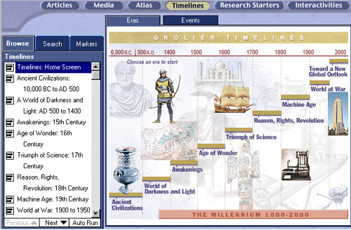
View some of the interesting time lines and GUI's (Click to Enlarge)
http://www.sonic.net/mnitepub/pccafe/reviews/grolier2000/timeline.jpg


nice history of the Gantt. I never heard of the Harmonogram before, maybe I'll start to use that for people that fear the word Gantt.
ReplyDeleteAs a PM I would always make a Gantt and I think that I was the only person that found them of value. My business teams were only interested in the date that things were done.
Stumbled.
Hi Sreejith,
ReplyDeleteI've yet to witness a healthy project team that truly uses and/or benefits from a Gantt chart. Yes, we as PMs make them, and try to sell them. But is anyone listening?
I like your ideas of adding icons. Have you tried anything like this on your projects? If so, how was it received?
Wish you well,
Alec
Hi richard,Thanx for stopping by.
ReplyDeleteAlec :
Yes, I have used such concept in some of my projects & happy to say that I received lots of appreciation for the same.
See one of them here : http://4.bp.blogspot.com/_xTbS6MMkKdk/SQbTbAJPOxI/AAAAAAAAAqg/xovgPZtwHTE/s1600-h/Project+Mindmap.jpg
What you told is true ... many occasions Gantt Charts are made for documentation purpose and not really for Planning !!
a 10,000 activity schedule prisoned in the timeline grid simply challenges human vision and data processing capability of brain !
PM- world must start thinking about alternatives / enhancements to Gantt chart.
I would like to see the day when site supervisors carry project plan with them , just like they carry drawings !
This will happen only when each supervisor carry schedule for his piece of work and try to achieve the goals as specified.
Many of the construction staff down the line will only be having basic education and hence wont be able to read complicated schedules (Infact least interested since they are quite boring!) . But, I am sure , they will look at a graphical schedule if given with. Most of the people are attracted towards nice looking diagrams , icons and colours. It will be great if we can convey the required info in a single page.
Lets hope we will be able to see some revolution which make schedule quite simple and EFFECTIVE !
keep visiting PM Karma,
Cheers!
Sreejith
Sreejith,
ReplyDeleteThat map is a work of art. You could frame it and sell it!
Thanks for the inspiration.
Alec